Lessons from a Public Policy Student
April Turner, Graduate Student and Public Policy Intern, North Carolina Center for Nonprofits
As a public policy undergraduate student, one of the many things I learned is the importance of data within the realm of public policy and advocacy. Data provides a foundation of evidence upon which decisions can be made; more specifically, data allows policy-makers to make evidence-based decisions. Prior to spring of 2022, I had yet to understand the true role of data science in public policy and how it increases efficiency and overall understanding. In the spring of 2021, I took a class (PLCY 460 – Quantitative Analysis for Public Policy) in which I learned how to apply statistical techniques, using STATA, in public policy program evaluation, research design, and data collection and management. I learned many useful tools but still felt like something was missing; I needed to see real-life application.
One year later, I took PLCY 710 – Data Science and Public Policy. In this course I learned how to code in R and the basics of Tableau. I also learned that I thoroughly enjoy coding. As the course went on, I began to see more and more how important data science is in public policy and advocacy. I now understand that data is more than “data”, it is a science; it is constantly evolving and new techniques are being developed to help us better understand trends all around us and advocate for change. Data science, the way I see it, takes numbers and makes them visually comprehensible in the form of simple or sophisticated maps, graphs, interactive tools, etc. Data science creates a narrative and makes more sense of trends and patterns; not everyone speaks numbers and data science allows for effective communication without all of the potentially confusing numbers. I finished this course with a deep hunger and desire to further explore how coding can be truly beneficial in my own public policy experiences.
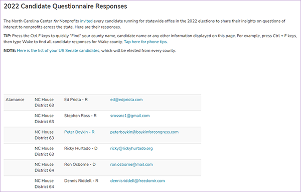
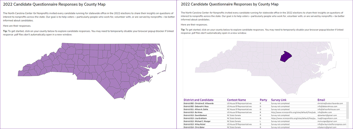
I was fortunate enough to be welcomed to the Center as a public policy intern and the timing could not have been more perfect. I had been interning with the Center for about a year and as I approached my transition to being a public policy intern, I had the opportunity to work more closely with the Center’s Vice President for Public Policy and Advocacy, David Heinen. The Center decided to conduct a questionnaire through which candidates for statewide office in the 2022 elections could share their insights on three questions of interest to nonprofits in North Carolina. The goal is to help voters be better informed about candidates in preparation for election day, and to make candidates more aware of the importance of the nonprofit sector. What initially began as a project working with Excel and updating the website with new responses quickly turned into an opportunity to use my data science skills and knowledge to facilitate information sharing. The Center was inspired by the Public School Forum of North Carolina’s 2022 NCGA Candidate Survey response page and I was eager and equipped to turn the Center’s response page into a more engaging, visually appealing, and interactive tool for achieving our goal. (Special thanks to Elizabeth Paul with the Public School Forum of North Carolina for sharing some of the logic behind creating a map in Tableau.)
I was given the opportunity to use my coding skills to clean up an Excel sheet containing more than 2,000 rows and bridge it with my newly acquired Tableau skills to create an interactive map that allows users to hover over a county of their choice and, in a matter of seconds, learn who is running for office, view their survey response, and also access a candidate’s email to encourage them to complete the survey if they have yet to. Rather than spending countless hours in Excel manually creating new columns, cleaning up others, shifting text to other columns, etc., I used R studio to type 1-2 lines of code to complete each task within a fraction of the time.
As I went about cleaning the dataset and prepping it for use in Tableau, I realized that I was applying the skills I had learned – one of which was how to properly search for answers to my coding questions online. I was getting to apply and expand upon my knowledge to help the Center work towards achieving their goal. Prior to this opportunity, I had almost exclusively viewed coding in the context of website or graph creation. I learned that there are many uses and applications for coding and that it is a great tool for working more efficiently behind the scenes to create a more user-friendly product. Coding can be used for the sole purpose of cleaning up a dataset that is not in an ideal format; it can be used to run linear regressions and assess relationships between variables; etc. Through this project, I was able to understand and see how data science is beneficial in my public policy pursuits and appreciate all that it can do.
If there is one thing I recommend to anyone in the sphere of public policy and advocacy, it is to have a working knowledge of powerful tools such as R and Tableau. I also recommend that individuals in these spaces advocate for its inclusion in curriculum; technology is the future, and R and Tableau are on the rise. At the end of the day, data matters, but the story that you tell using data science is what gives it true power and meaning.
April Turner is a graduate student at the University of North Carolina at Chapel Hill pursuing a Master of Public Policy. She currently serves as the public policy intern for the North Carolina Center for Nonprofits. April is passionate about the nonprofit sector and its commitment to uplifting the community.